

Hoagies’ Gifted Education Website
Group UX/UI/Front-End Dev Re-design Project (2 member team)
Duration
3 weeks
Key Skills
User interviews, ideation, prototyping, usability testing and iteration, wireframing, mid-fidelity prototypes, AB testing, usability testing, responsive web design, interaction design, Kanban boards and teamwork.
Tools
Miro, Adobe Xd, Zoom, Google Suite, Trello, Html, CSS, Bootstrap
The Problem
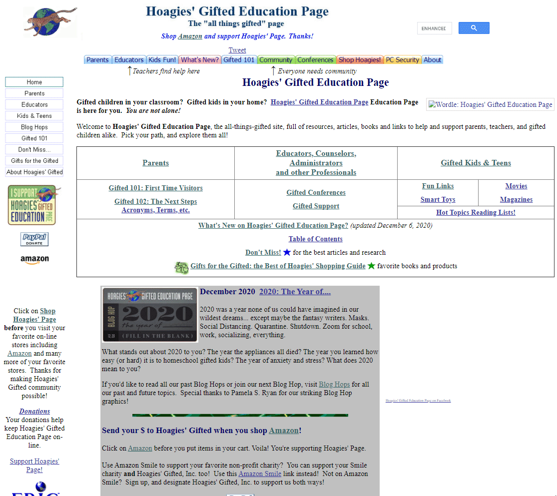
Hoagies’ gifted education website is an up-to-date and recommended hub of information about "all things gifted" with thousands of resource pages and links, but it’s appearance is sorely dated and users found it incredibily difficult to access the large catalog due to the visually chaotic layout, minimal content-chunking and poor information architecture.
The Solution
A visually appealing and welcoming design aesthethic that introduces content-chunking, new information architecture to make it easier to navigate, a powerful advanced search feature to accesss all resources as well as collections of resources to aid in discoverability of information.
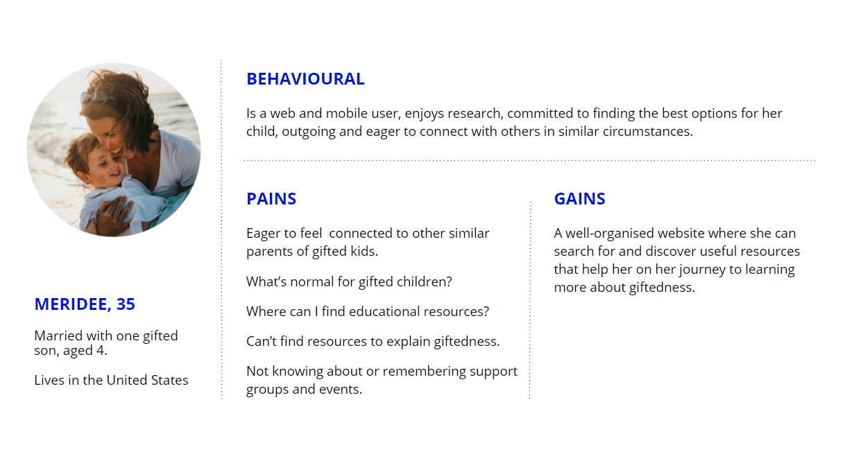
User Research & Definition
We performed 5 user interviews with parents and teachers of gifted children in person or over Zoom. We wanted to better understand what parents and teachers were most interested in learning about when visiting a website about giftedness. We then asked them to attempt to locate this information. Most were unsuccessful, even though the information was there in some cases, and made comments like, "I would run away from a site like this". We also sent out a survey to 14 parents of gifted children asking them about topics they would like to learn about in a gifted website. This, more research via common search engine searches and our competitor research helped us uncover topics that were of popular interest, which helped us refine the information architecture later in the process. Exploring the site and conducting a heuristic evaltion brought us to the understanding that the primary challenge of this redesign was finding a way to make accessibile a vast number of resources.
The original homepage lacked informational hierarchy and content-chunking and the whole site suffered from poor usability.
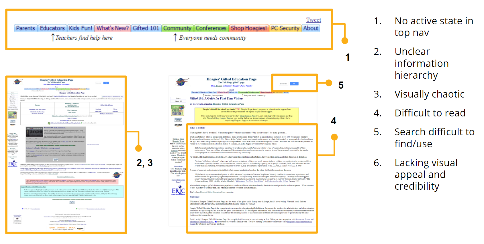
An heuristic evaluation of the usability of the original site leading us to the conclusion that the primary challenge was that of presenting and making accessible a vast number of resources.
Information Architecture and Ideation
We conducted a card-sorting exercise to map the existing information architecture and then to imagine other ways the content could be organized, taking into account the user research. We noted that, given the huge number of articles and compilations, it would be difficult to make all of the content visible in the top or even secondary navigation. Through brainstorming, we came to the decision to create, in addition to pages devoted to parents, teachers, community and supporting Hoagies’, a "resources" page. This would primarily contain an advanced search tool that would help people find exactly what they were looking for. If they were not sure what they were looking for but wanted to discover new subjects, there would be curated resource lists sorted by topic.
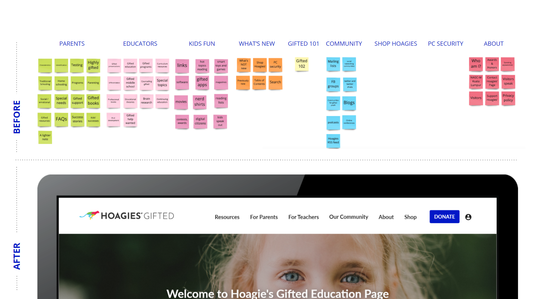
Original site map and new top-nav categories. We also created a full site-map showing secondary level categories.
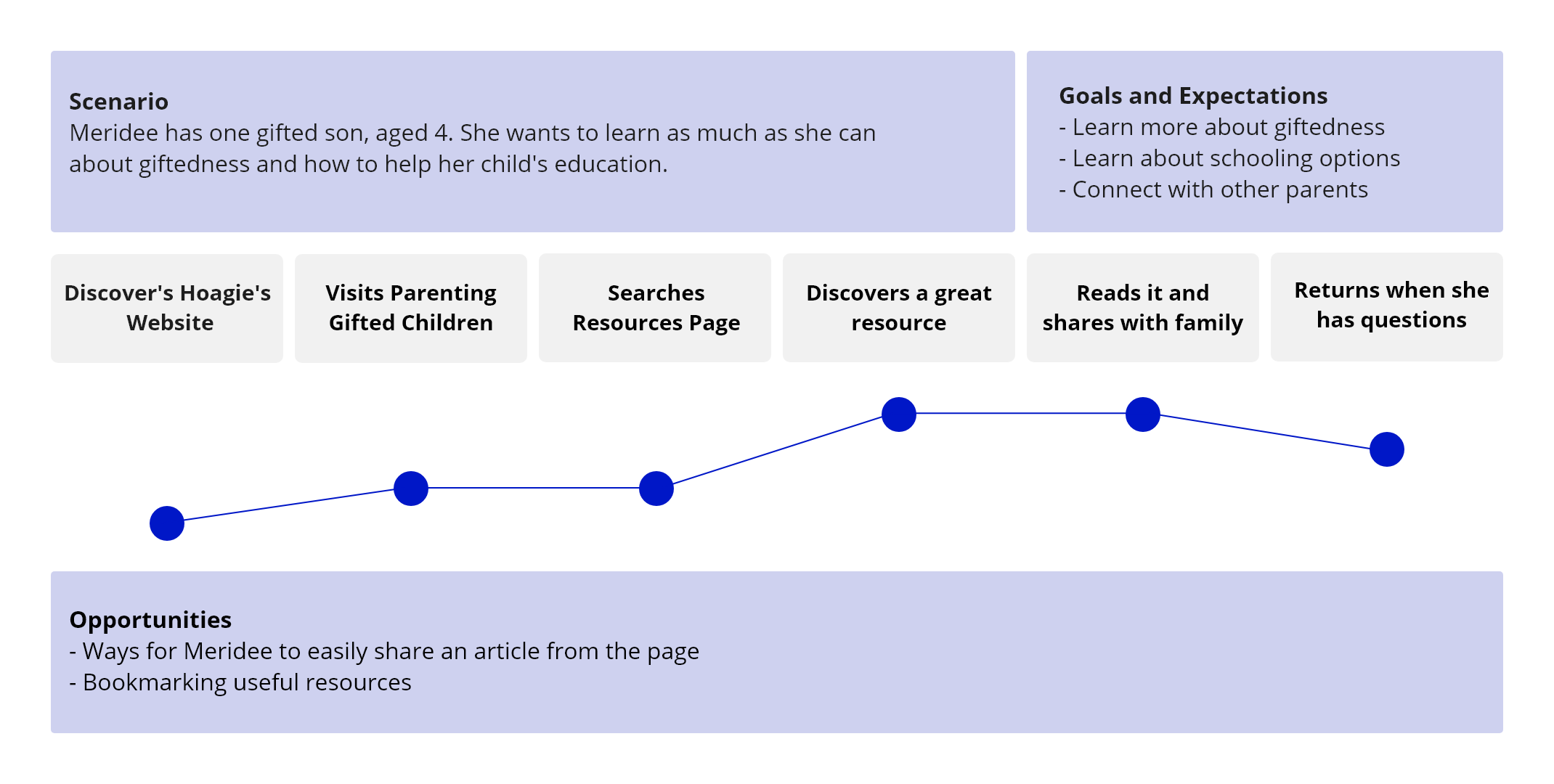
User scenario and journey map showing how our persona makes use of the proposed resources page. The y-axis is positive feelings and the x-axis is time. This exercise helped us identify some opportunities to enhance the design, such as the ability to bookmark and share an article.
Wireframing, Prototyping and Usability Testing
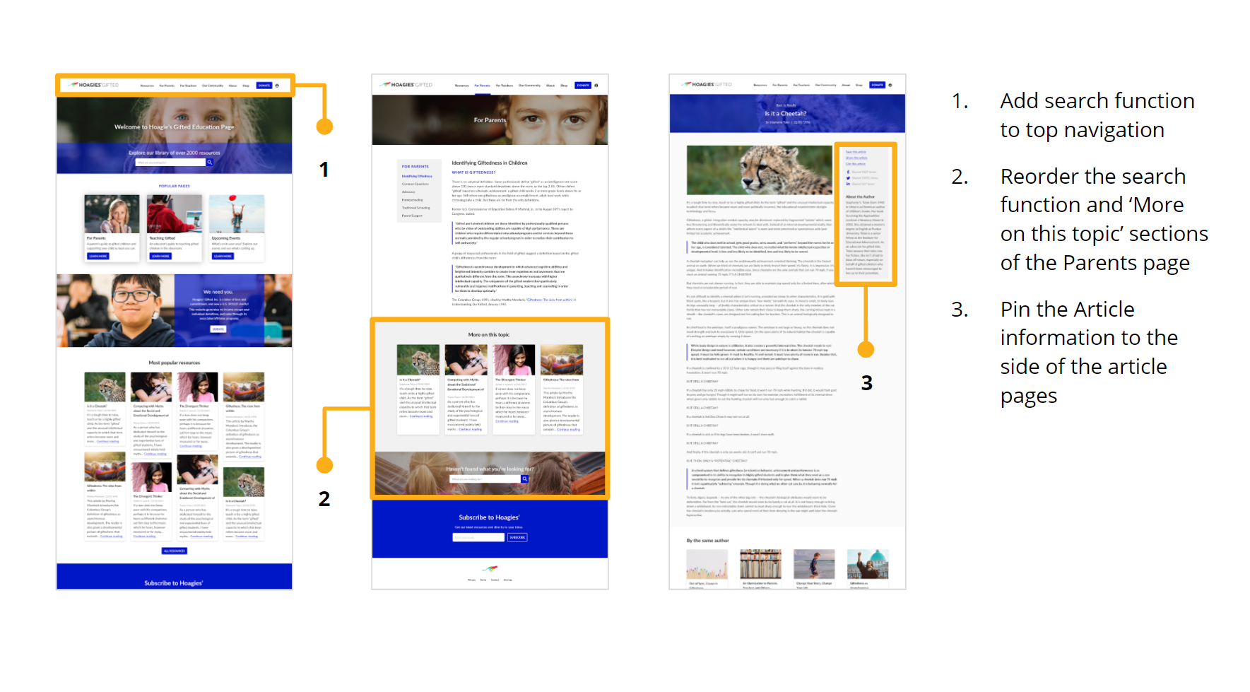
We created wireframes of the homepage, the parent’s page, the resources page, the search feature and an article. We quickly developped this into a low-mid fidelity prototype. We conducted usability testing to validate the main features of our design, such as finding resources within the parent’s page, using the resources page and reading an article. The testing showed that our design was sound, but we received useful feedback, such as the suggestion to show more articles by the same author. From there, we created a high-fidelity design and conducted another round of usability testing. Some minor changes were made based on user-feedback at this stage. For example, some users had a little trouble finding the search bar at the bottom of the for parents page, so we added a search icon to the top navigation to make it consistently available and easier to find.
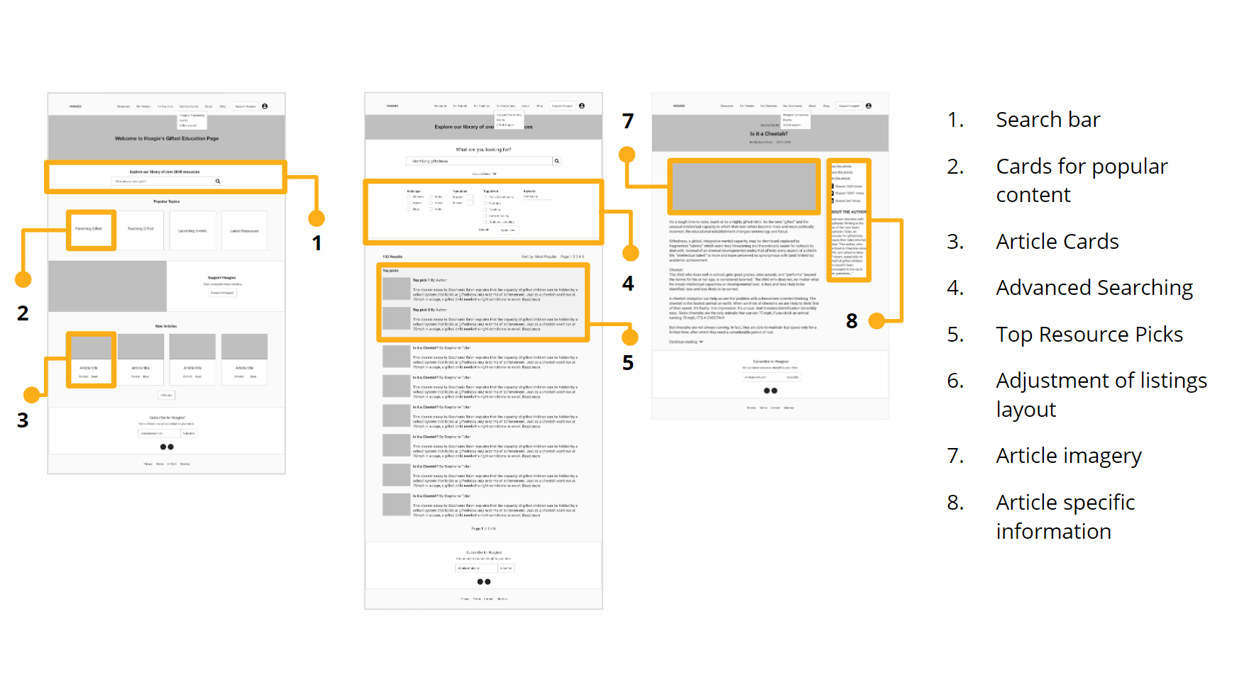
Some of the low-fi wireframes showing key features we designed and tested.
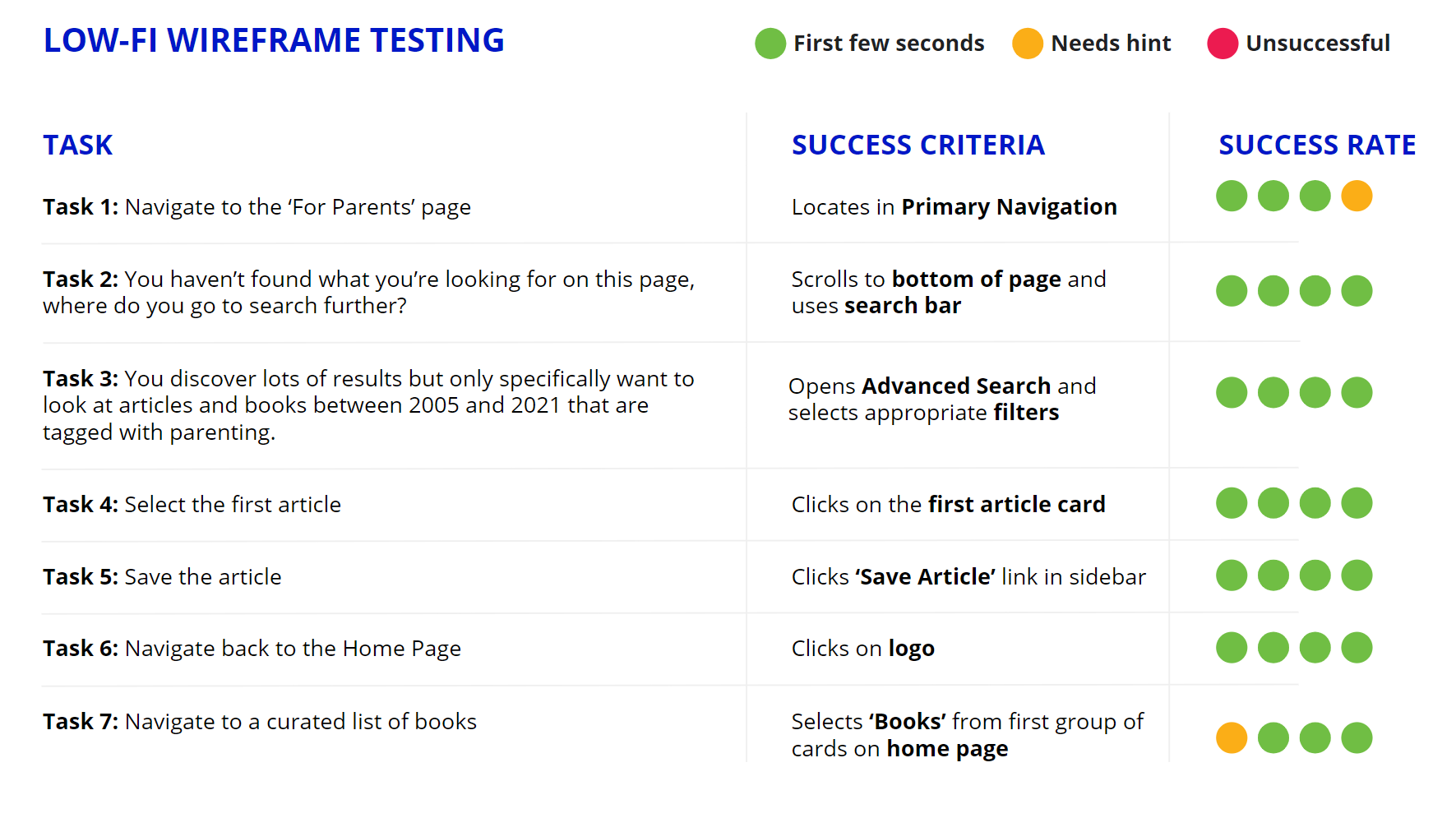
Low-fidelity prototype usability testing results.
High-fidelity prototype usability testing results.
HTML Style Guide
Initially, we made a style-tile in Adobe XD which informed the development of the high-fidelity prototype, including colours, fonts, buttons and card styles. At the end of the project we created a responsive website version of the style tile made in HTML/CSS using Bootstrap. This website has coded within it the font styles, colours, header format, card styles and button interactions. It also includes media queries for various breakpoints, so it demonstrates how sizes and formats of elements change accross screen sizes, which you can see in the code and by resizing the page in the browser. We felt this would be a helpful resource for the front-end development team. Check it out here. The image styles, fonts and colours were chosen to communicate a friendly, welcoming vibe, while also bringing a sense of credibility and professionalism.
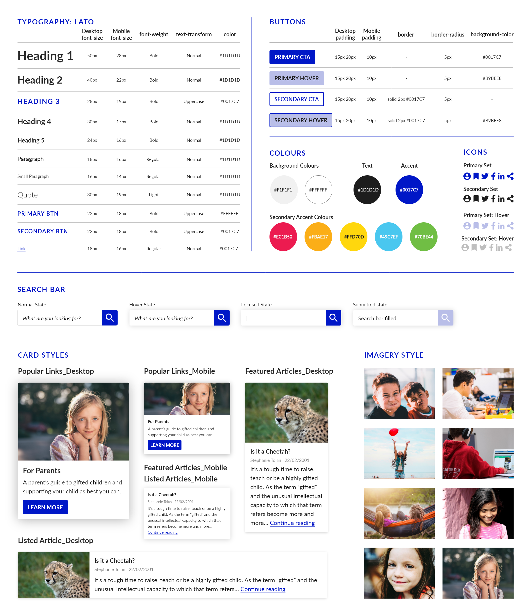
Adobe XD version of style-tile. Web version available here.
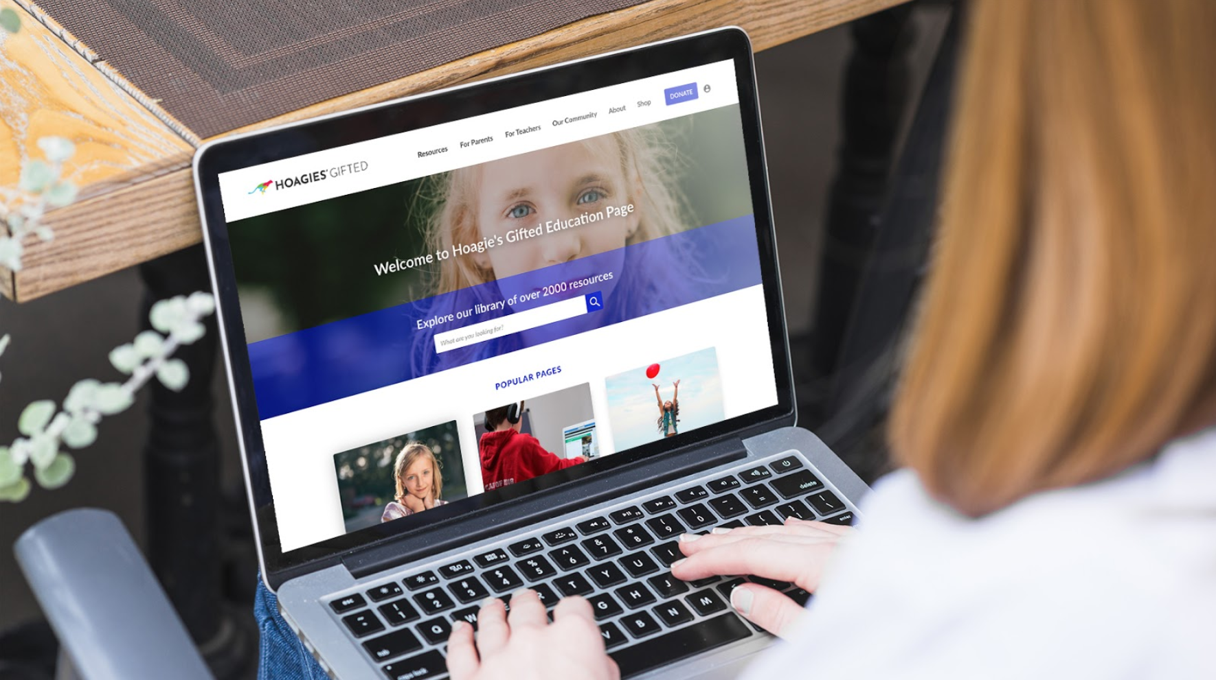
The Final Design
The final high-fidelity clickable protototype made in Adobe XD has a both a desktop and a mobile version with multiple pages. It contains real content from the website, as well as additional content to meet the identified needs of users. View Adobe XD prototype here.
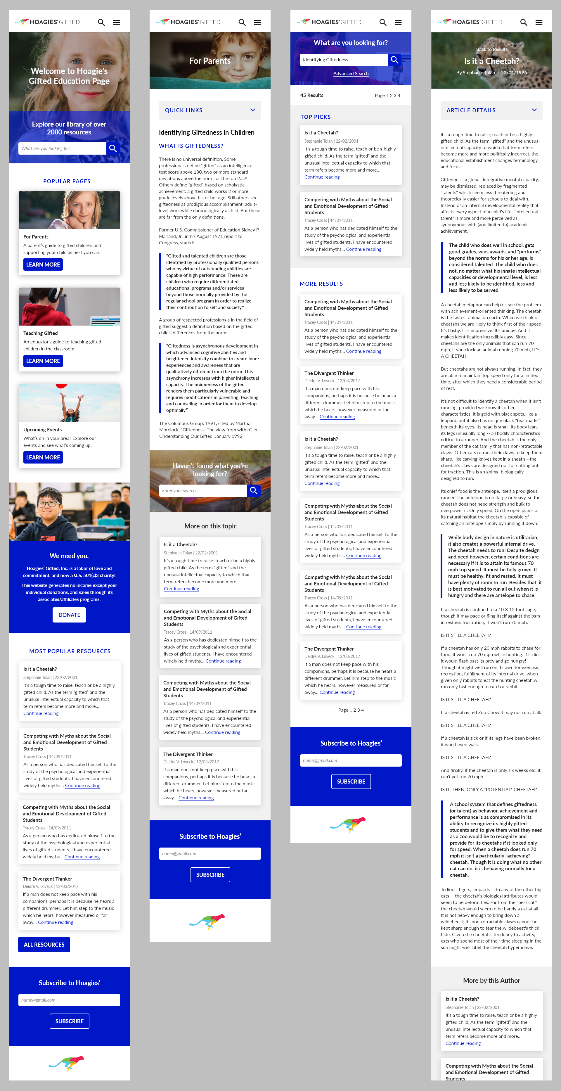
Some of the pages of the final mobile prototype made in Adobe XD.
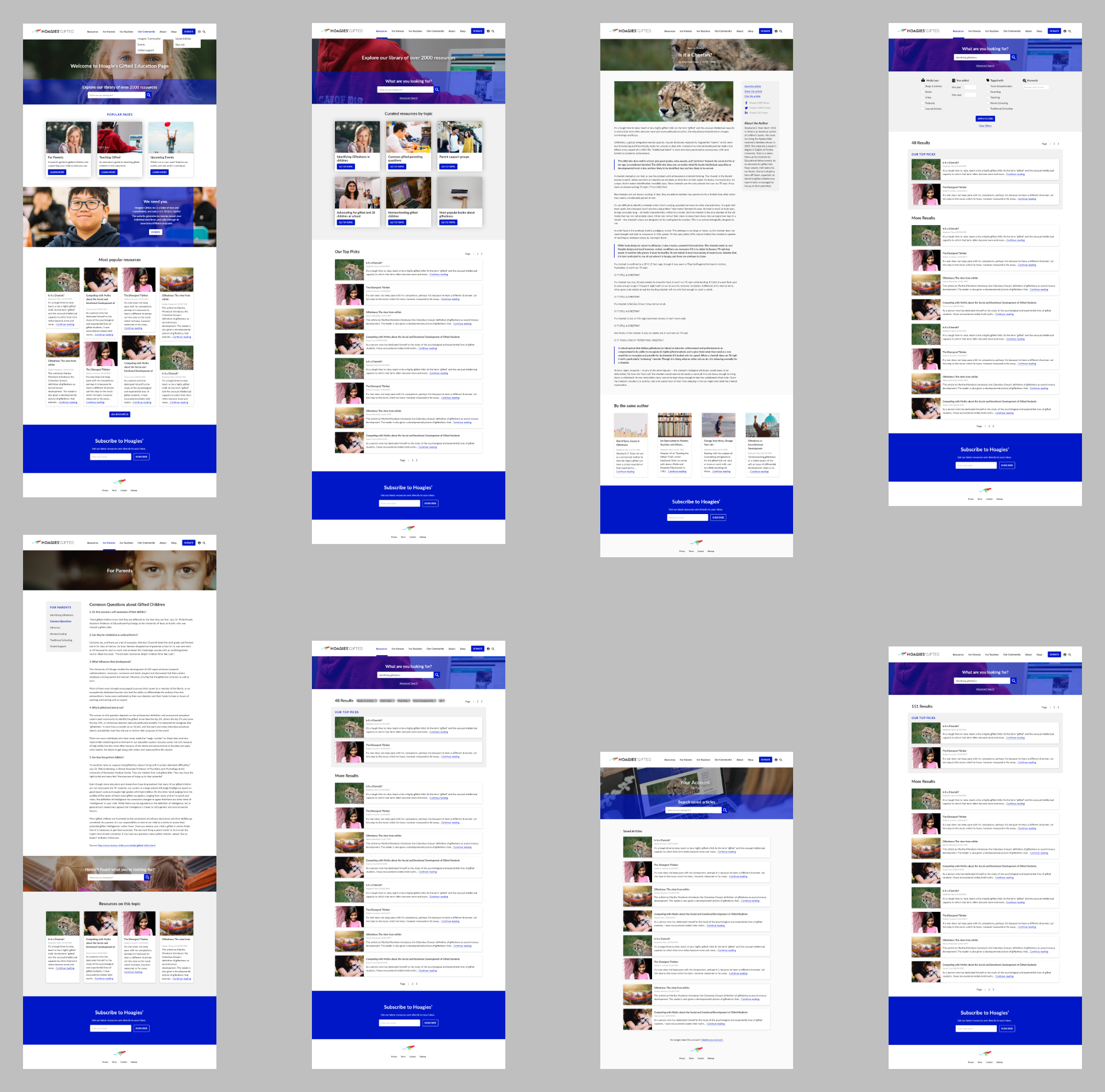
Some of the pages of the final desktop prototype made in Adobe XD.
Conclusion & Next Steps
In summary, we redesigned the information structure, created clearer information hierarchy and navigation, designed an advanced search function to access all the resources and created better information chunking on article pages to make them easier to read, plus we added new features to assist with sharing and saving resources. Our next steps as we progress with the project are to flesh out the other pages on the site as outlined in the IA. Some of the more specific next steps include introducing an Events page with calendar integration, Online forums, a Teacher’s resources page and finally, a section for gifted kids and teens.
View Adobe XD prototype.
Go to the next case-study >