

Trees for Life
Website redesign for the Not-for-Profit Organization, Trees for Life. UX/UI group project.
Duration
3 weeks
Key Skills
User interviews, survey, stake-holder correspondence, heuristic evaluations, information architecture, prototyping, usability testing, AB testing, high-fidelity mock-ups, responsive web design.
Tools
Miro, Figma, Adobe Xd, Zoom, Google Suite, Trello
The Problem
The Trees for Life website needs a little polishing and clearer, simpler user flows, as well as new functionality to increase community engagement.
The Solution
A redesigned homepage that better communicates Trees for Life’s mission to visitors and new pages with a new workshop sign-up feature and a simplified donation process.
User Research
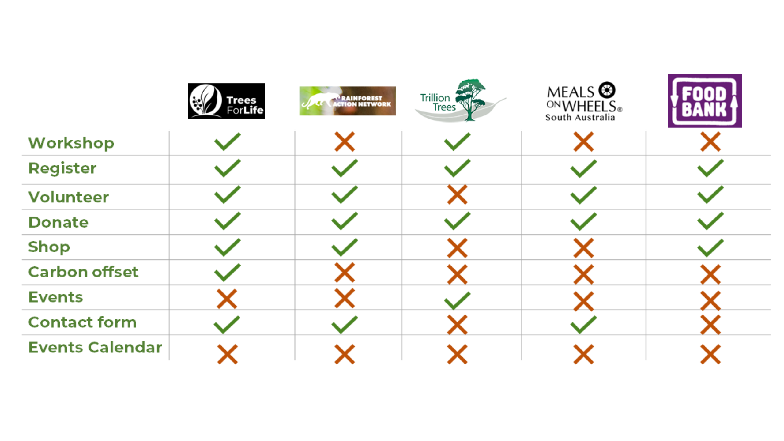
We began with usability and accessibility heuristic evaluations of the website to look for areas of improvement and also straight away contacted the Trees for Life organization to get their input. To deepen our empathy for the Trees for Life user, we interviewed two people who were similar to our proto-persona (one of whom had actually volunteered previously for TFL). We circulated a survey on social media and recieved 51 responses. We also completed 5-second tests with these users for a few key Trees for Life pages to get their initial impressions. Finally, we conducted competitor research to determine what similar charities were offering on their websites.
Take-aways from Research
From the interviews, we learned TFL needed:
- Evidence of impact of NFP
- Sign-up and booking confirmation for workshops
- Secure and simpler donations
- Better content chunking for text heavy pages
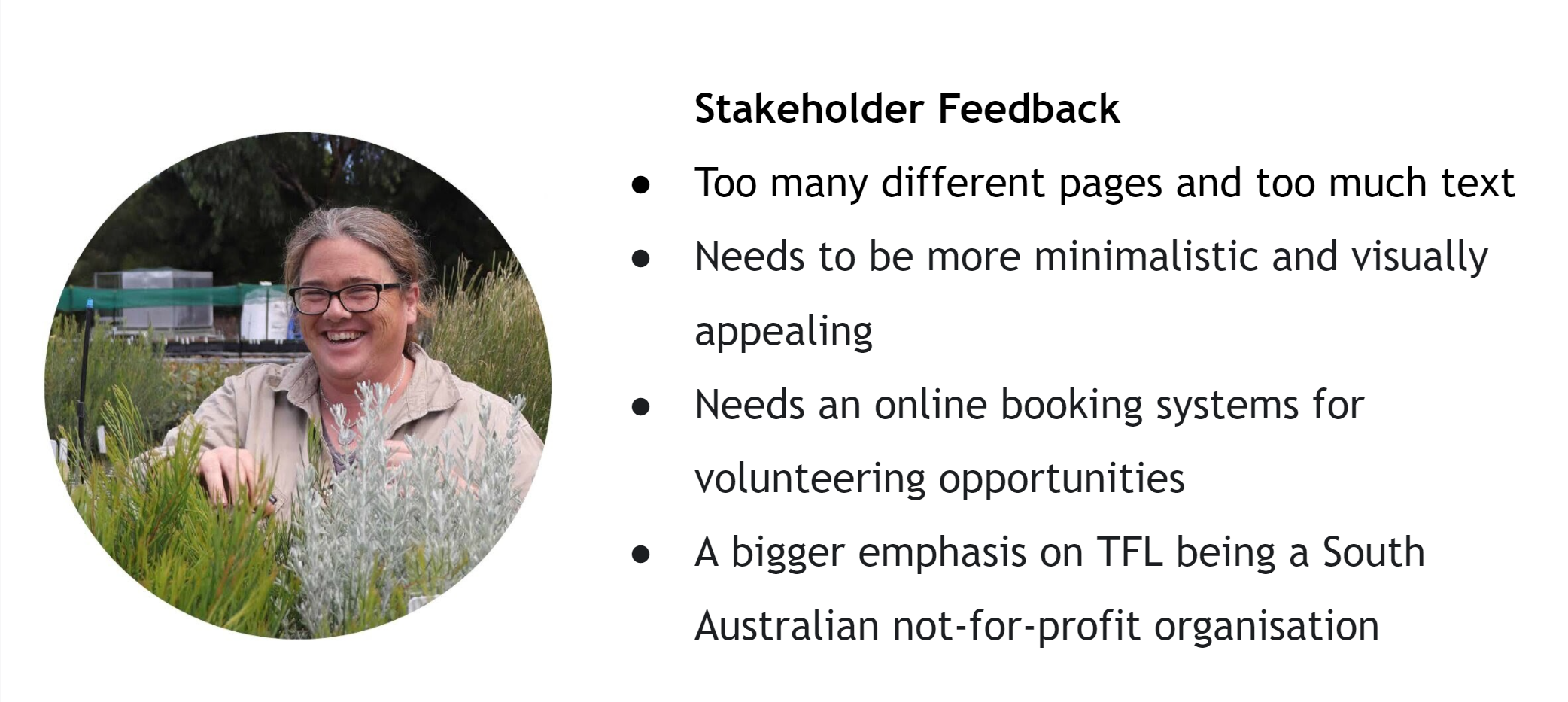
Those who filled in our surveys were most comfortable with donating and attending workshops. The NFP stakeholder contact highlighted the need to reduce text-heavy pages and make them more minimalistic and visually appealing, the need for an on-line booking system for volunteering and a bigger emphasis on the organization being South Australian. A competitor analysis revealed that there was an opportunity to emphasize the carbon off-set offering and to provide a workshop calendar.
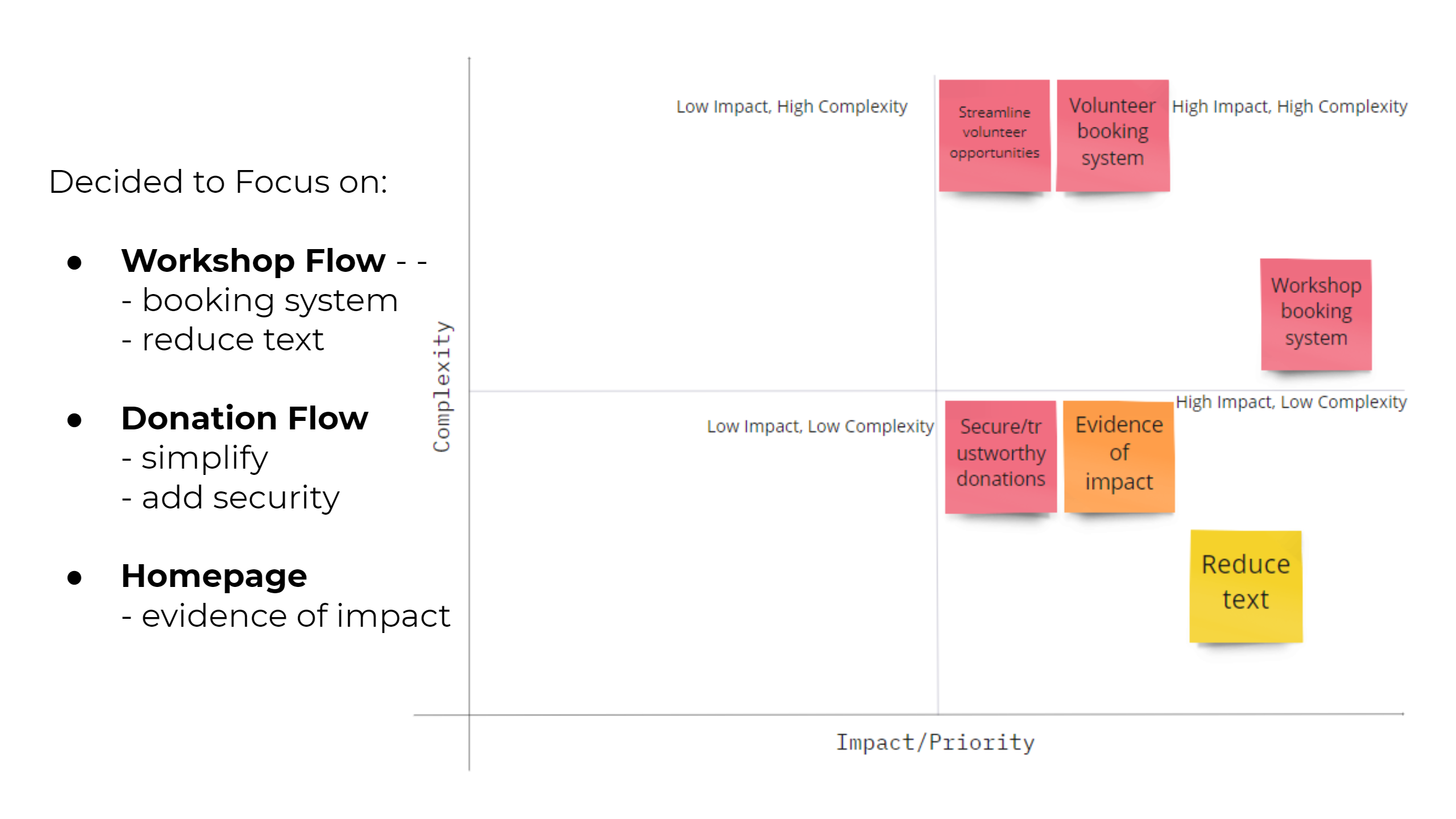
Ideation
Based on all of the research, we generated ideas for how to proceed and ordered them in a feature prioritization matrix. We decided to focus on: a new workshop booking feature for workshops, a simplified and safer-appearing donation flow and a new homepage that would have more evidence of the impact TFL is making.
New User Flows
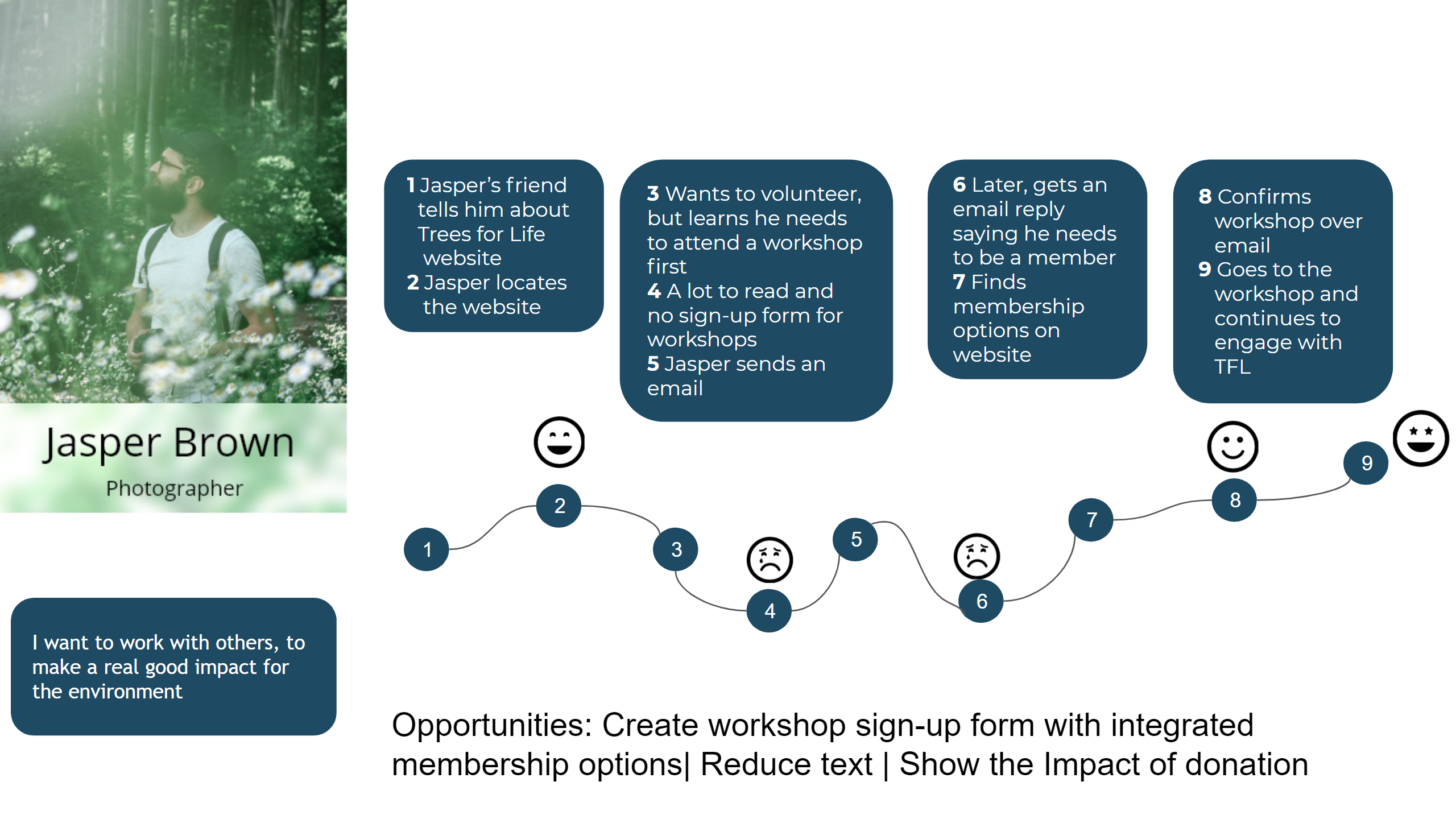
User-journey map demonstrates user pain points: Here is a user journey map of Jasper trying to sign-up for a workshop:
- Jasper’s friend tells him about Trees for Life
- Jasper locates the website
- He wants to volunteer, but learns he needs to attend a workshop first
- There is a lot to read and no sign-up form for workshops
- There is only a link to an email address, so Jasper sends an email
- He waits around for a while and finally gets a response - an email reply saying he needs to be a member in order to participate in the workshop (this is on the website, but not prominently displayed)
- He goes to the TFL website and finds membership options on website
- He confirms workshop over email
- Goes to the workshop and makes friends with like-minded people and as a result continues to engage with TFL
This is a success story, but we can see many places where a less motivated person would have given up. A smoother and clearer path from interest to engagement is needed - namely, a workshop booking system. Perhaps also if the homepage showed the impact of donation, Jasper may have considered donating earlier.
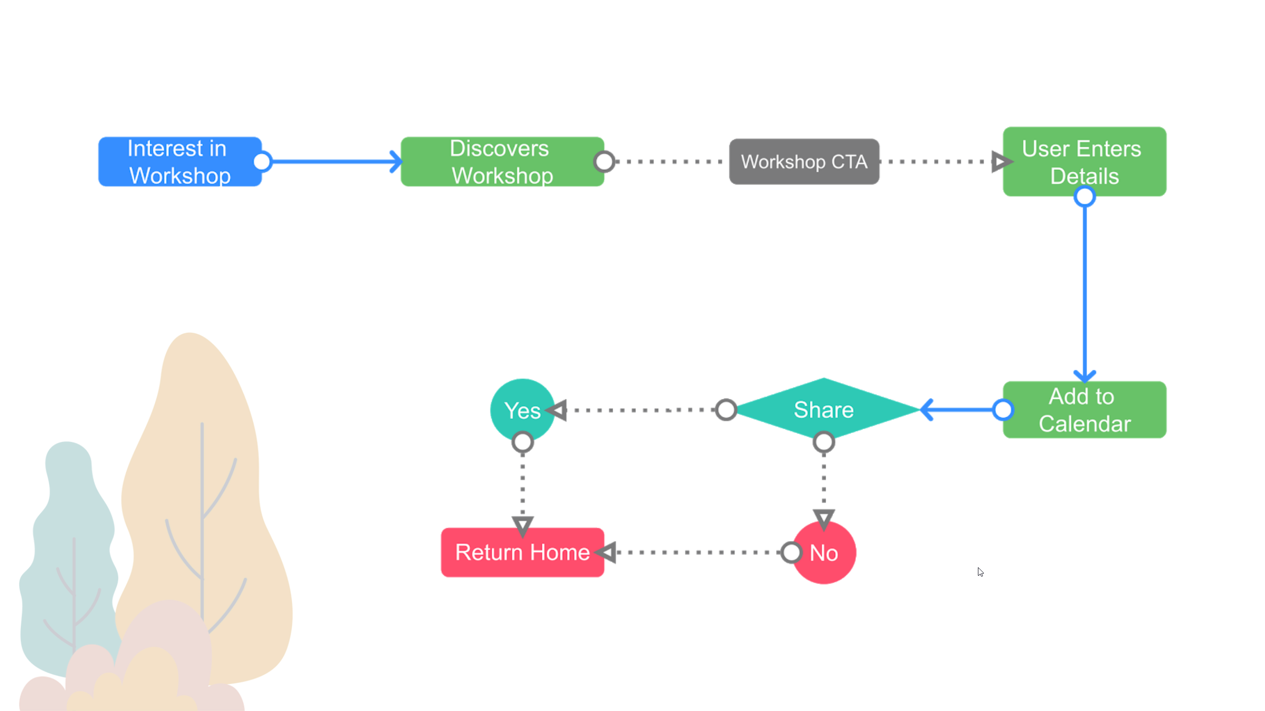
User flow for signing-up for a workshop - this is a flow that didn't exist in the original site.
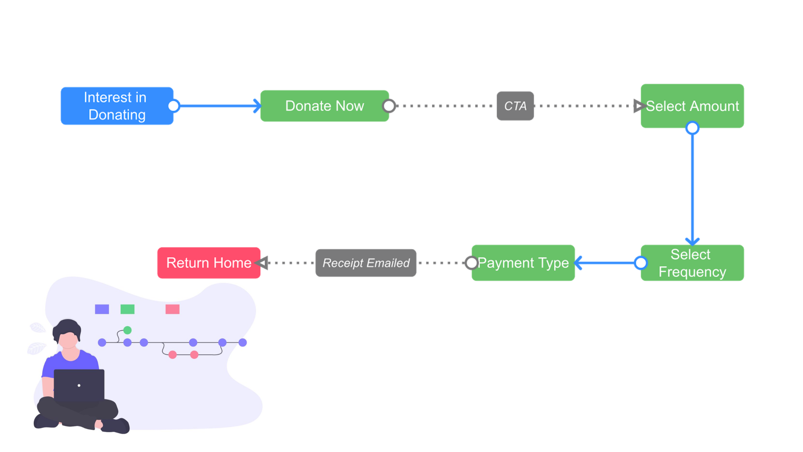
User flow for making a donation - this was our attempt to simplify the donation process.
Style-Tile and Style-Guide
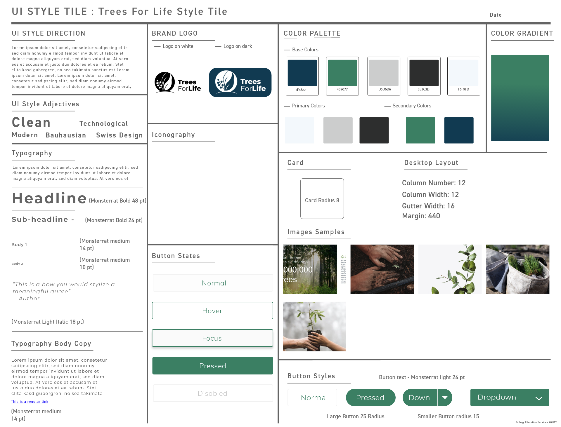
We wanted to keep a similar brand feel to the original website, due to a recent upgrade we felt it just needed a little polishing. Based on the suggestions of the TFL stakeholder we tried to create a more modern and minimalist design aesthetic which could be implemented holistically across the site. As a team we created a mood board of images, fonts, and site layouts to create an aesthetic that would eventually influence our final design. In the end we opted to keep the site's original font; Montserrat; however, we added softer edges on cards and buttons, as well as implementing a modern blue and green palette, along with aspirational imagery to create a calm and trusting feeling, whilst reinforcing the brands goals and ethos.
Wireframing & Testing
As a team, we collaborated in Miro to create a common vision for the design in accordance with the new user flows. We then divided the design into sections and each prototyped a part of the site in Figma and Adobe XD. Through several rounds of usability testing, our design evolved until the point where we could present a high fidelity prototype. As a final step, we used a simple form of A/B testing on our high-fidelity clickable prototype to help us answer some questions about the donation flow and finally arrived at the finished design.
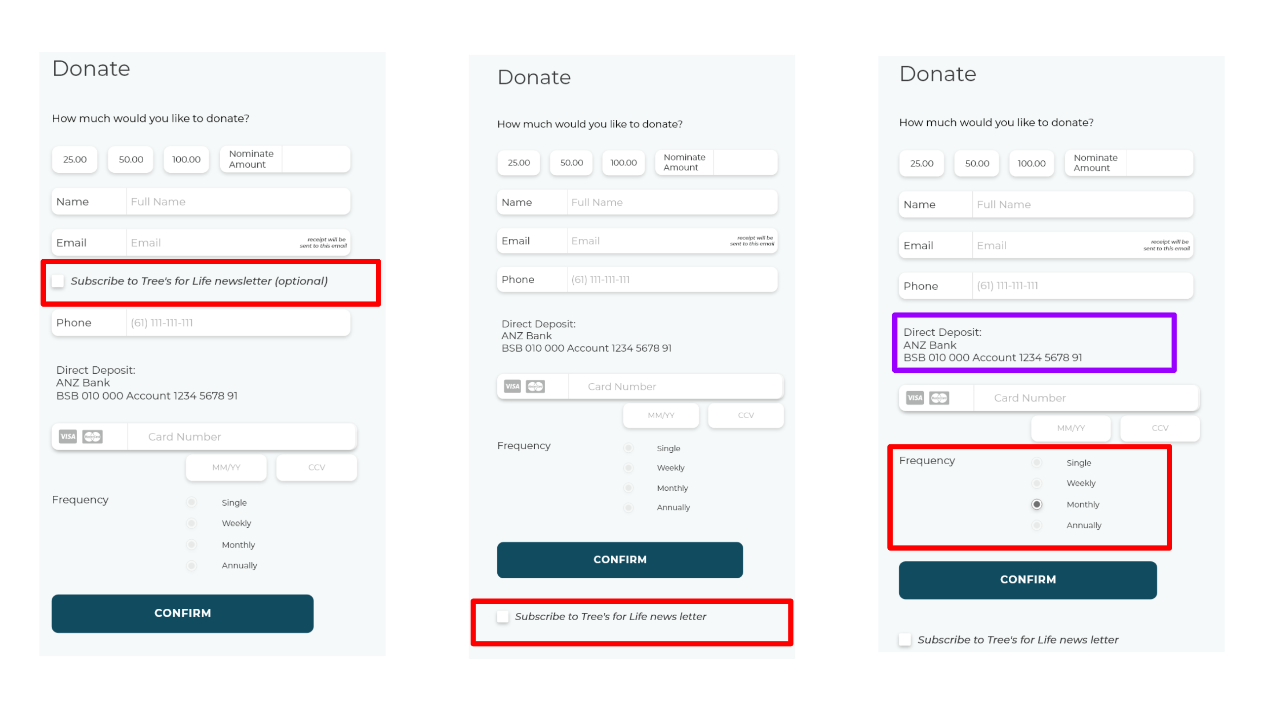
We conducted AB testing on the donation flow to help us make some important choices about where to place certain parts of the form.
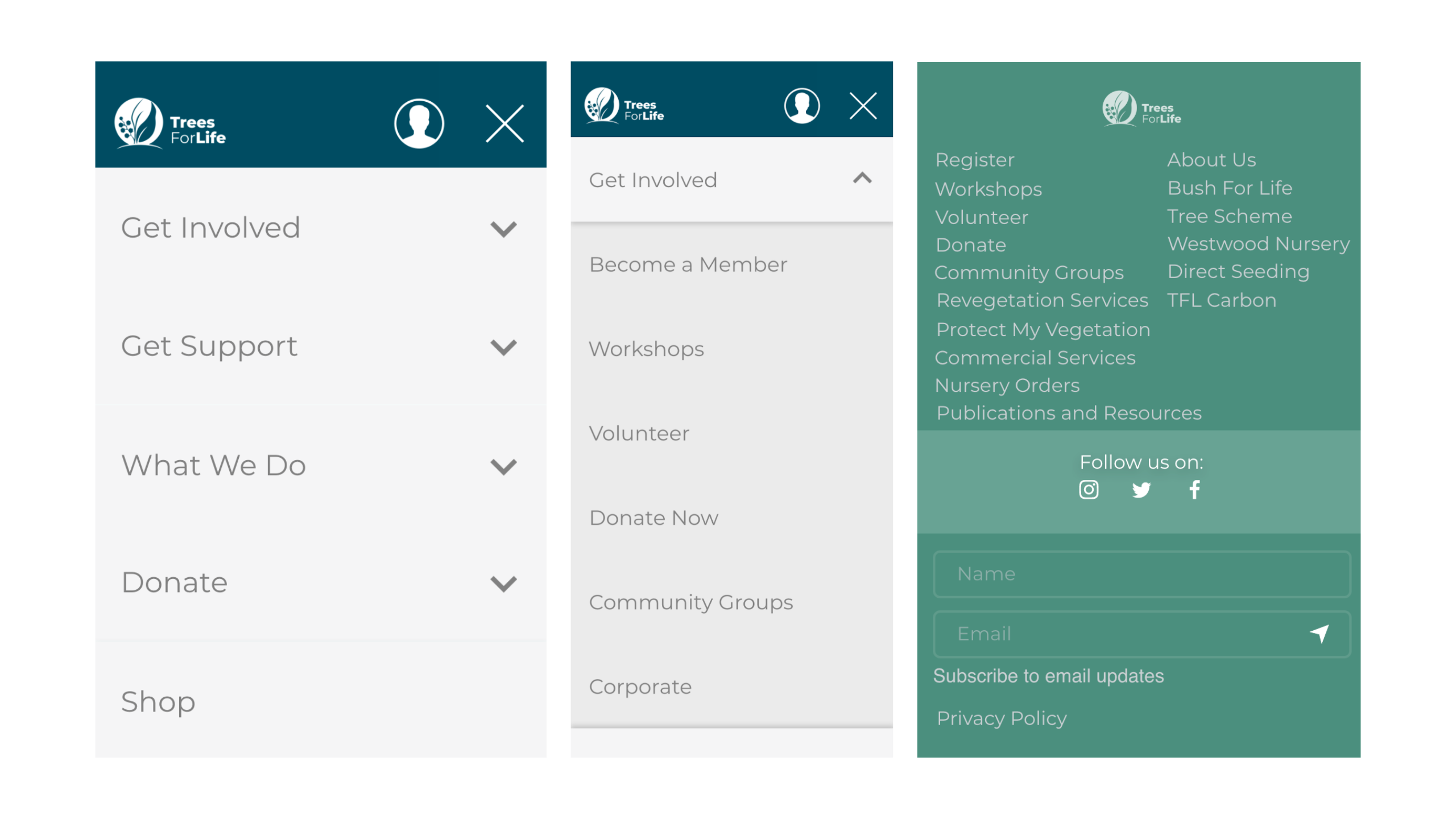
Navigation for the mobile version.
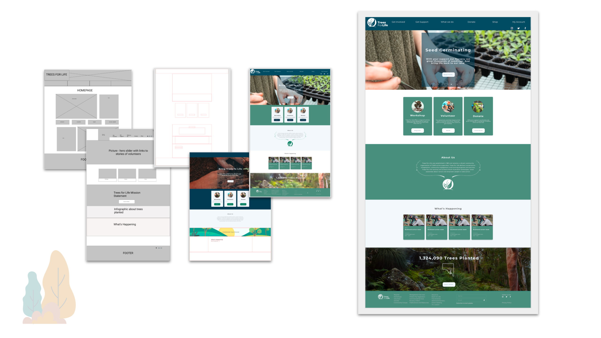
Evolution of the homepage design from wireframe to final design.
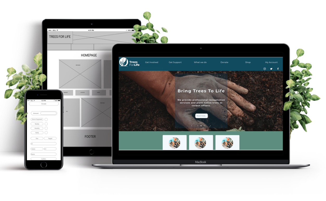
How the desktop scales down to mobile.
Final Design
The final high-fidelity prototype includes a redesigned homepage that aimed to display the impact the NFP is making through number of trees planted, images and descriptions in a slider at the top showing visually what they do. The homepage also highlights the offerings our user research indicated needed to be more accessible, namely; workshops, volunteering and donating. We also created pages for the workshop flow that visually chunked the information and made it more digestible, while also adding a booking feature.
One issue we only came to realise at the end of the project was that potential workshop participants would need to become TFL members before signing up to a workshop. So, ideally, we would have created an integrated membership and workshop sign-up process. Instead, we just included a link to the membership form, which isn't ideal. Alternatively, we could ask the organization how they felt about charging one-off fees to attend a workshop instead of requiring membership, as this could be a good entry-point to higher levels of engagement.
We also redesigned the donation process. Initial user testing suggested it was difficult to locate a simple donation button; however, it could be argued that the new donation flow isn't a big improvement on the original design. Ideally, I would in future like to revisit this section of the redesign to include more ways to donate and more information about where donations go to give greater confidence.
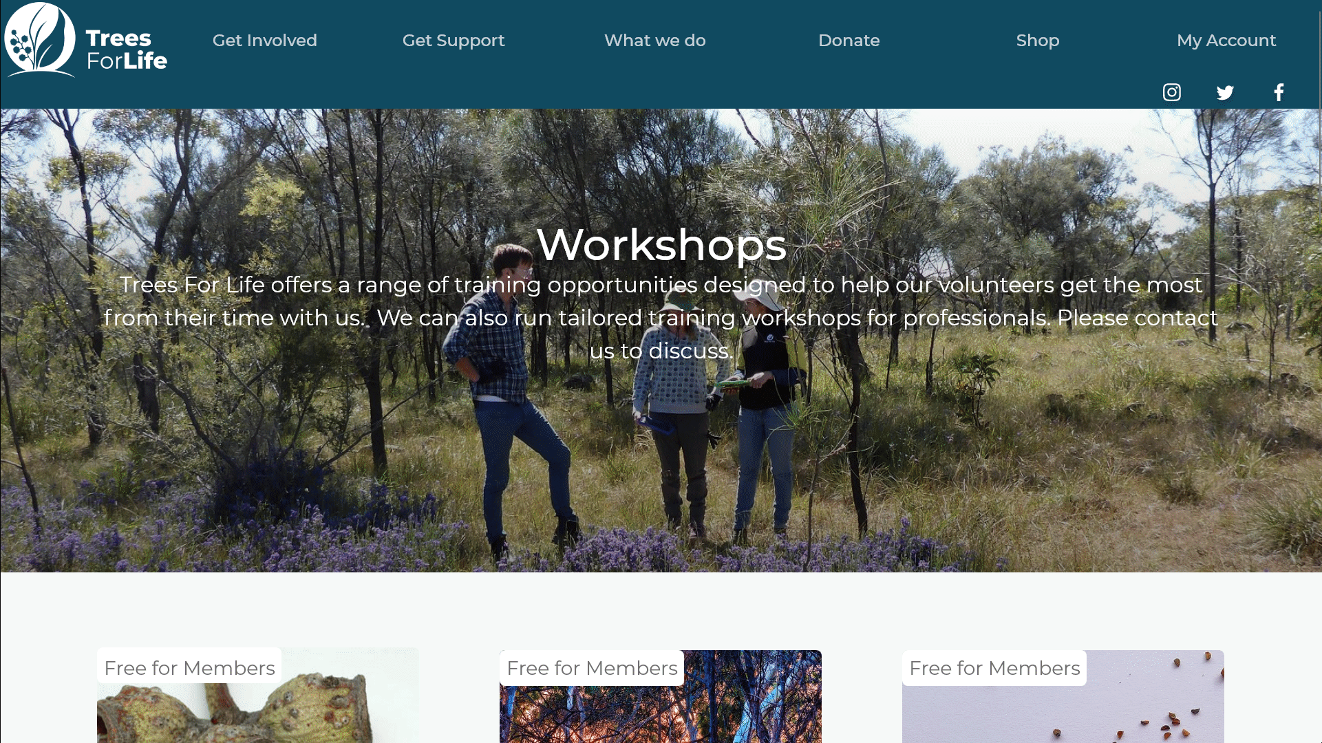
The main workshop-booking page.
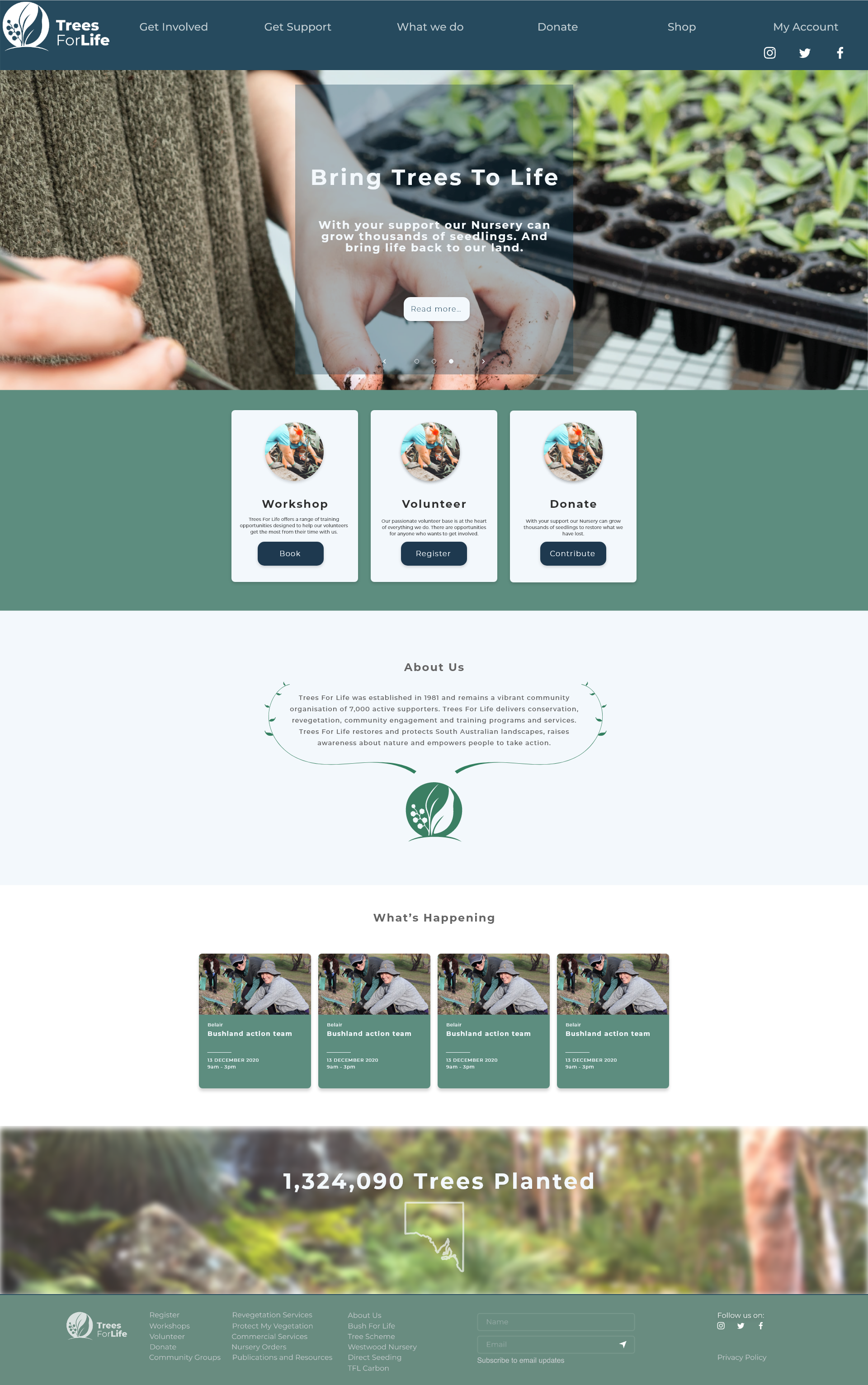
The final homepage design. We made a prototype with several pages covering the homepage and 2 user flows (workshops and donation).
Conclusion & Next Steps
This project was a valuable experience in analysising an existing website for it's current user flows and, through user research and talking to stakeholders, determining how these flows can be improved. In future, we would talk to NFP about workshops allowing non-members to attend for a small fee, or rolling membership sign-up into workshop sign-up process. We would work on a simplified volunteer information flow and sign-up process, add other features requested by stakeholder e.g. new shop and add a contact form (as based on competitor analysis). This project really helped us learn to read every page of the existing website to fully understand their product before attempting to reimagine it. To broaden the user research and to iterate accordingly
View AdobeXD prototype.
Go to the next case-study >