

The Australian Space Agency
Website redesign for a Government Agency. UI individual project.
Duration
4 weeks
Key Skills
User interviews, heuristic evaluations, user path, information architecture, prototyping, usability testing and iteration, high-fidelity mock-ups, responsive web design, interaction design.
Tools
Miro, Adobe XD, Zoom, Google Suite
The Problem
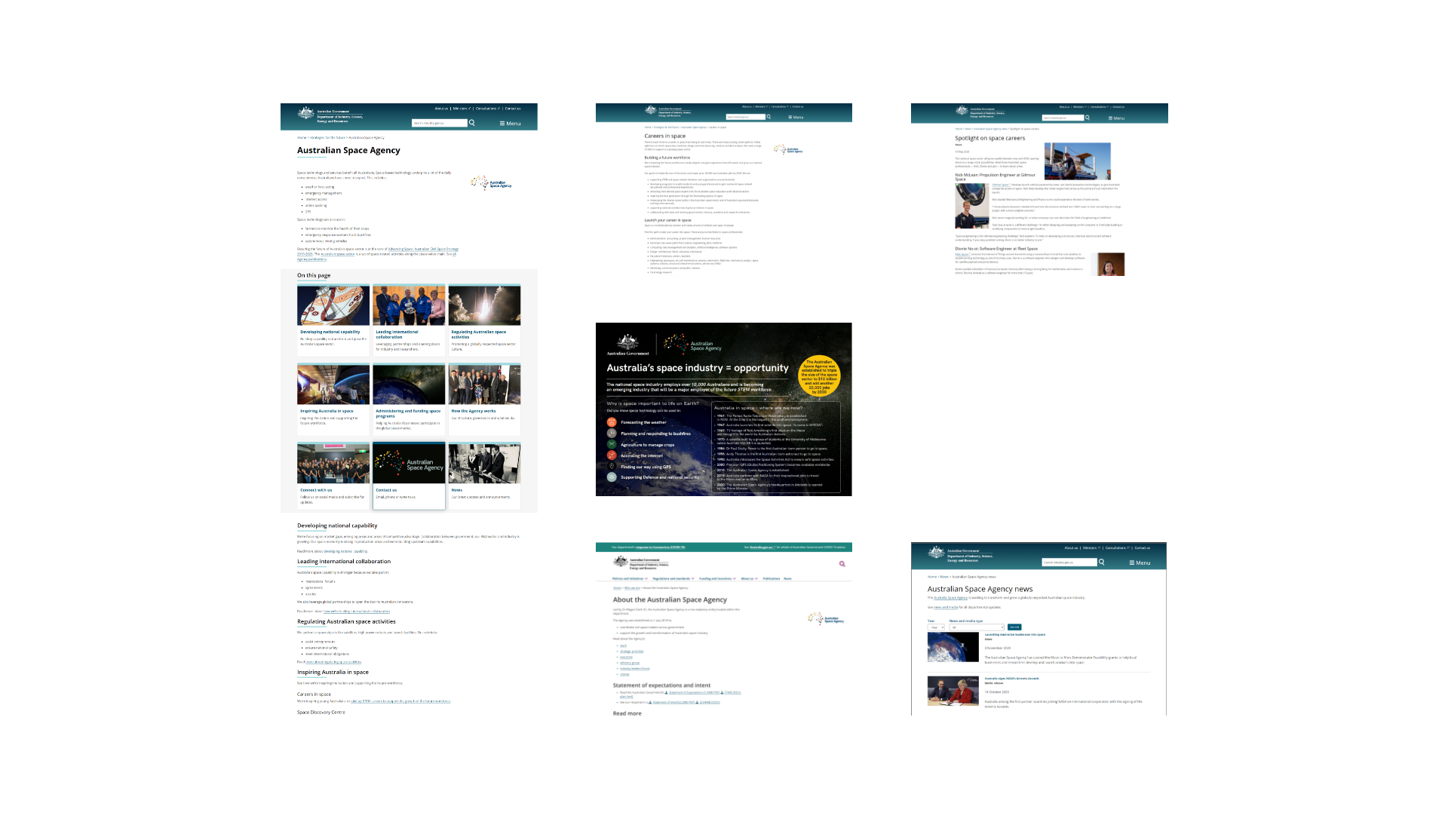
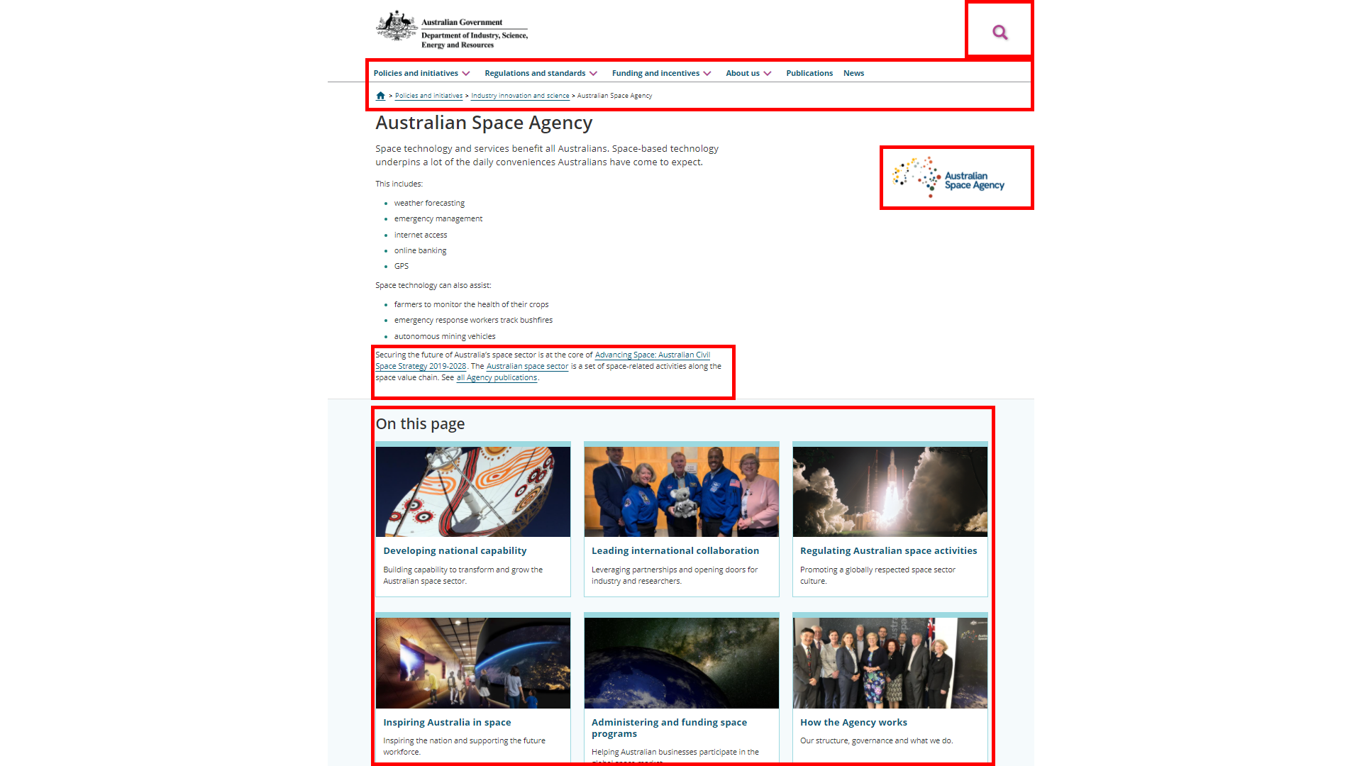
The Australian Space Agency has web-pages located within a larger website. It is difficult to navigate around the pages and users found the main page to be confusing with too many links.
The Solution
Design a new, independent homepage for the ASA that reflects the goals and mission of the ASA and allows users to easily discover and access all content. Plus, a clearer funnel towards actions visitors can take.
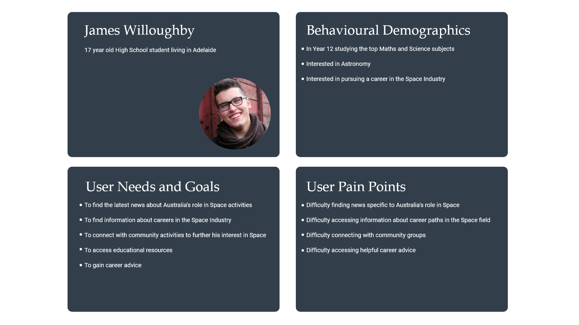
Proto-persona to imagine how someone might use the ASA website.
User Research
The first phase of the redesign involved getting a clear picture of the existing content structure and using the site to understand the Australian Space Agency's aims. In future, it would be helpful to also hear directly from the organization and to speak to some people who typically interact with the site. Next came evaluating the usability and accessibility of the original website. This was accomplished through heuristic evaluations and noting the results in tables and through red-lining. To gain empathy for the users, I created a proto-persona and imagined the pages within the site that he would want to visit (user path and wire-flow), but also considered other potential users and their needs. Next, I undertook two rounds of usability testing - the first focused on general usability and the second focused on the usability of the navigation structure.
Take-aways from Research
- The homepage needed a clearer sense of hierarchy. Although there were some cards that were highlighted with images, there were also large portions of text with multiple in-text links which made the site harder to navigate and usability testing showed users often struggled to locate key content.
- The navigational structure of the page was lacking - as the ASA page is a page within a greater site, the navigational structure (top navigation, footer links and search) were directing users to irrelevant content.
- The tone of the content was flat and uninviting when compared to the stated aim of the ASA to "inspire Australians in Space". I wanted to create a site whose tone and visual appearance better reflected what I understood to be the Space Agency's goals.
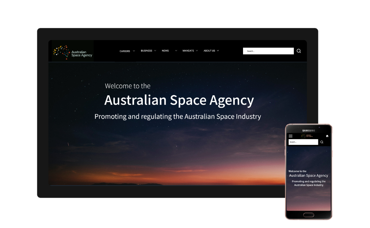
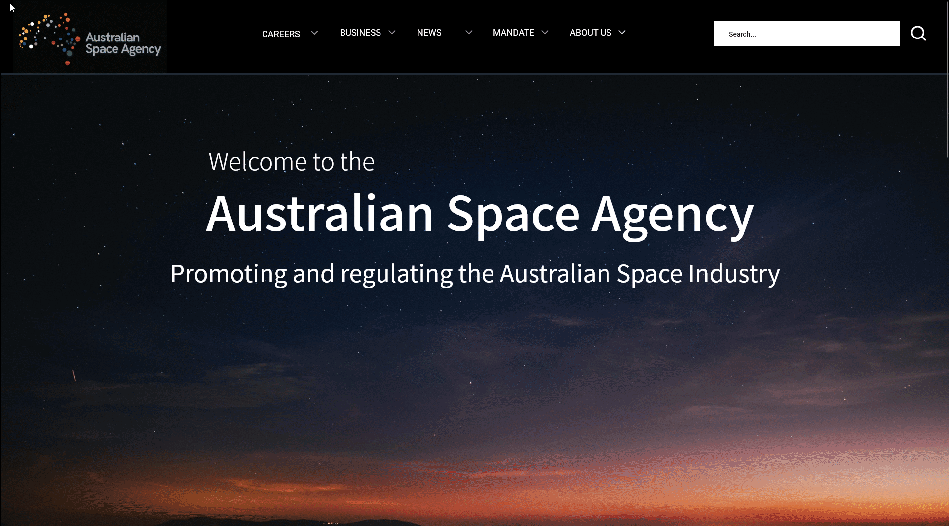
New Navigational Structure
The solution to the problems identified in the research phase appeared to be creating a new, independent website with it's own navigational structure for the ASA. Determining a new hierarchy for the whole site and also for the homepage was a natural next step. I used a spreadsheet to note down every link in the main page and then all the links on the secondary pages. I used card-sorting to experiment with a new arrangements of content and eventually arrived at a new site map, which was iterated several times as I continued the design process.
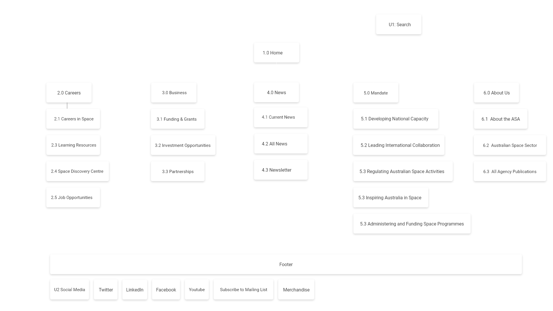
Homepage Hierarchy
On the original main page, there were about 50 links and was attempting to address many issues. To avoid the problem of users being distracted and confused by so many options, I considered the hierarchy of content of the homepage and decided to focus on the following:
- About the ASA
- News
- Careers
So, the new homepage is mostly aimed at stimulating interest in the ASA, sharing timely news and then using that interest to lead them towards getting a career in the Space industry. I imagined that, given more time, I would create other landing pages that would be aimed at other important goals of the ASA, such as communicating the responsibilities of the ASA and sharing key publications as well as a page for the business community. Therefore, it became apparent that the ASA might need to have several key landing pages that could be well optimised in search engines so that people reach the right part of the site, rather than one homepage that attempts to meet the needs of all users.
Responsive Navigation
After establishing the site-map, I created a top navigation bar, search bar and footer for larger devices (e.g. desktop) and a smaller search icon, hamburger menu which displays a accordion menu and footer for smaller devices (e.g. mobile).
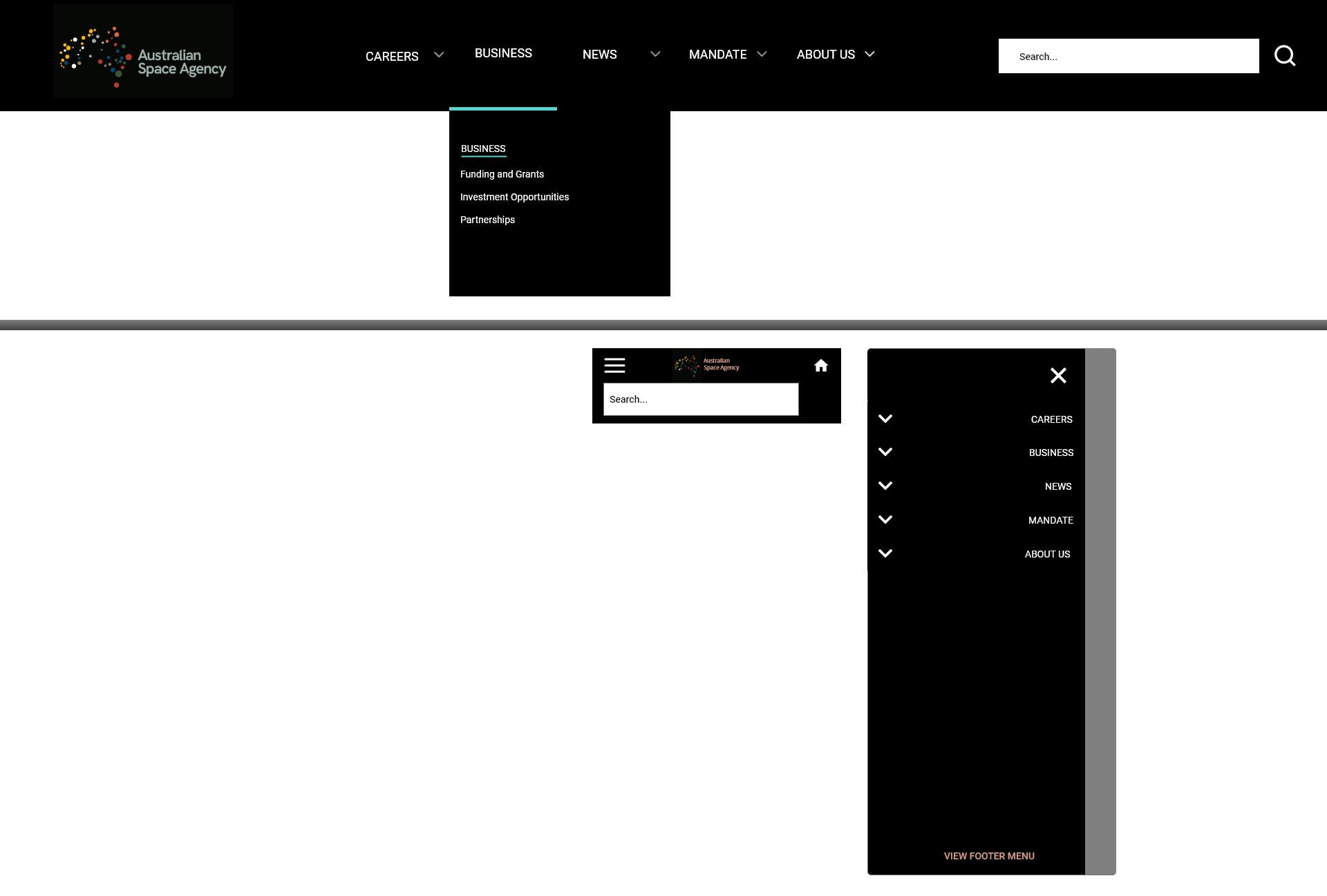
The top-nav in desktop mode and the burger menu in the mobile version.
Interaction Design
I created hover, focus and active states for buttons and cards, as well as other components in Adobe XD.
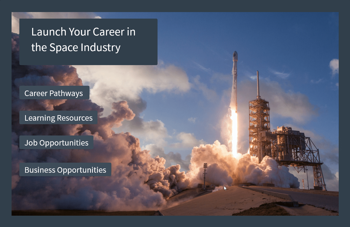
Learning about a career in space is a key goal of the ASA, therefore the new site channels visitors from curiosity to a tangible action of learning about career options. Hover interactions shown.
Style Guide
Created a space-inspired, futuristic theme, with some warm tones to reflect the connection to the Earth and to history as well as to the future of Space travel. The style guide included guidelines of column system, spacing, typography, colours, iconography and interaction states.
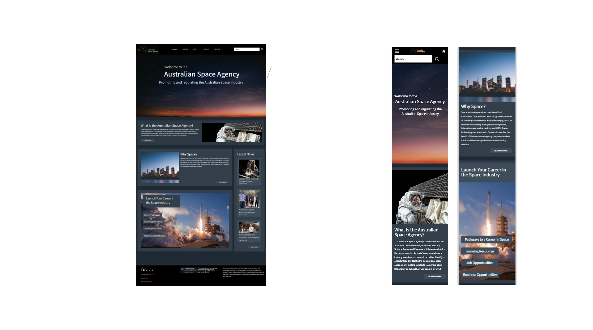
Usability Testing New Homepage
A clear understanding of the homepage content and visual design only emerged through iteration informed by user testing and consultation with mentors.
- Five-second tests
Revealed that most users couldn't remember much of what they saw of a wireframe of the site in 5 seconds. I decided to reduce and simplify what I was including in the homepage.
- Usability Testing (round 1)
Homogenized font sizes, improved ability to return to home page and changed the colour scheme slightly to make it easier to see buttons as well as a few other minor improvements.
Conclusion
This was a really great experience in understanding what's involved in a website uplift as well as some important aspects of user interface, such as interactions, style guides and responsive webdesign. In future, I would test the updated prototype to confirm it meets the user’s needs, reach out to the Australian Space Agency to better understand their priorities for the site and update further pages, especially those that are landing pages for other subsections of the site, such as the mandate of the ASA, which could showcase their various roles and responsibilities visually.
Go to the next case-study >